With credit to Rob Hyndman’s terrific blog for the inspiration, I’ve redesigned MichaelGeist.ca to do a better job with standards compliance and to allow for shorter takes and easier navigation. Please bear with the inevitable bugs. Feedback welcome.
New Look
3 Comments

Recent Posts
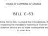 Debating the Online Harms Act: Insights from Two Recent Panels on Bill C-63
  The Law Bytes Podcast, Episode 199: Boris Bytensky on the Criminal Code Reforms in the Online Harms Act
  AI Spending is Not an AI Strategy: Why the Government’s Artificial Intelligence Plan Avoids the Hard Governance Questions
  The Law Bytes Podcast, Episode 198: Richard Moon on the Return of the Section 13 Hate Speech Provision in the Online Harms Act
  Tweets Are Not Enough: Why Combatting Relentless Antisemitism in Canada Requires Real Leadership and Action

Nice! I do see a few rendering glitches here and there in Opera 8.52 but I am grateful for the larger text. You may also want to reconsider either some of the information that you have haloing your posts or your commitment to making the page fit on 800×600 screens; many of the rendering errors may go away if the content is given a bit more space.
Regardless, I appreciate your work and read your site every time you update.
Thanks Colin
Colin, Thanks for the comments. We are working on a wider version as 800*600 is becoming rare. We are very receptive to comments. You can also contact the developer directly at ncostello@360opencommunications.ca
New Look feedback …
While I understand why you would want to update the look of your site, I think you can improve things further.
The centre column is difficult to read:
1) It is not wide enough (there should be longer lines of text to make it more readable).
2) And it is too similar in width to the adjacent columns, it is hard to visually distinguish central and secondary content.
If you made the centre column more prominent (wider) than the two outer panels, your eye would be drawn to the main page element.
Also try varying your fonts to give the page more visual interest.
I alway enjoy the opinions you express and am grateful you are taking up this cause.